
A self-published author has two distinct roles: author and publisher. After the author-self has completed all the revisions based on feedback from peers and beta readers and the work has been professionally edited, the author hands the final product over to the publisher-self. For the new publisher, the variety of decisions and choices can be overwhelming.
For example, font selection is a critical decision. A first-time publisher needs a font that is transportable; that is, one that requires fewer technical changes in creating the layouts for ebooks and print books, and one that meets the requirements of major distributors: Amazon, Kobo, Ingram Spark, and others. While it sounds daunting, selecting a font takes only six steps.
Step 1. Serif or Sans serif?
Serif fonts have a decorative stroke to finish off the letter; sans serif, do not. Note that “sans” means without. Examples of serif fonts are Times New Roman, Georgia, Garamond, and Baskerville. Examples of sans serif are Arial, Helvetica, and Calibri. The more common type of font for books is serif. Common practice for online viewing is sans serif. Even though ebooks are read on a screen, most publishers select the same serif font for both the ebook and the print book for simplicity in creating the two different layouts and for consistency between the two platforms.
Step 2. Embedded Fonts – What’s that?
The next decision is to select a font that is embedded. Fonts are created by developers. Many fonts are created without the inclusion of the complete technical specifications because system defaults are acceptable replacements for a typical personal or business printer or online. An important exception is the Portable Document Format, PDF, file that requires an embedded font to be truly portable. An embedded font includes its technical specs and is translated correctly by any printer.
For example, Times New Roman and Arial rely on system defaults rather than including the full technical specifications. The resulting fonts are technically different than the original fonts even though they are visually indiscernible. Who cares? PDF does.
Garamond, Janson, Bembo, Baskerville, Palatino, and Times New Roman are frequently noted on the internet as common fonts used in novels. The internet seems to be oblivious of the importance of embedding.
Step 3. Size matters
After narrowing down the selection to two or three fonts, the next step is to pick a font size. Font size is based on the font style, so Times New Roman 10 and Garamond 10 are not the same physical size. Because the font size on a computer screen can be adjusted for viewing, print a page using different fonts and sizes for a realistic comparison for the paperback.
Step 4. Save a File
To save the document as a PDF using Microsoft Word, select Save As PDF and Click on Options. Click the PDF/A box and save.
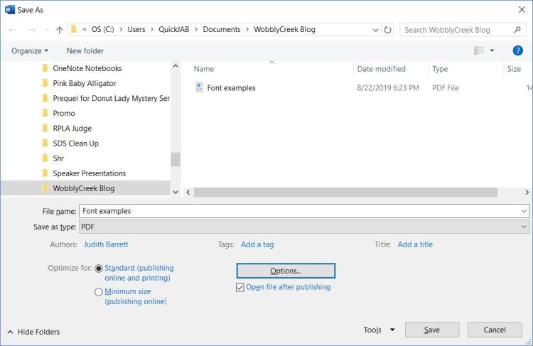

Step 5. Check the PDF file
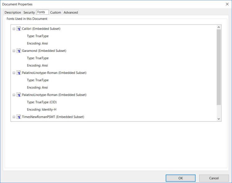
Check your font using Adobe Acrobat Reader. File | Properties | Font
The version of Microsoft Word used in this test does not include the fonts Janson, Bembo or Palatino. The sentences are in Garamond, Palatino Linotype, and Times New Roman. The default font in Word is Calibri.
The results show that Calibri, a sans serif type font, is embeddable.
Garamond, a serif type font, is embeddable.
Palatino Linotype is embeddable as Palatino Linotype-Roman, which is the change the system made. It might be tempting to say that’s not a problem, but the defaults on a different computer might not match the test system’s defaults.
Times New Roman PSMT is embeddable. The system changed the font from Times New Roman to make it embeddable. Another computer or printer might select a different font to make it embeddable. Times New Roman is not a good choice either.
Step 6. Use What’s Available
A self-publisher with an eye on the budget considers the availability of fonts that are included with the version of software used to create the PDF. Paying for a font is always an option, but the new publisher may prefer to use a more accessible font. The sample shows that Garamond is the best choice to publish with the installed version of Word. Adobe Garamond is the font for the text in the Harry Potter books, and Garamond is the text font for Hunger Games, so the sample novel is in good company!

